FOMO Techniques in Website Design

Ever hesitated on buying something online only to see “Only 2 left in stock!” pop up, instantly making you reach for your wallet?
That, my friend, is FOMO in action , Fear of Missing Out. And when used strategically, it’s one of the most powerful tools in website design to increase conversions, drive urgency, and boost user engagement.
Let’s break down exactly how to use FOMO on your website (without looking desperate) and why it works like magic on human psychology.
The Psychology Behind FOMO
FOMO taps into a basic human instinct: the fear of being left out. We hate the idea of missing opportunities, deals, or experiences that others are enjoying. It creates:
A sense of urgency
Emotional discomfort
An immediate desire to act
In web design, you’re not just selling a product or service—you’re selling timing. When visitors feel they might miss something valuable, they’re far more likely to convert.
This ties into psychological triggers like:
Scarcity (“limited time only”)
Urgency (“offer ends in 10 minutes”)
Social proof (“others are doing it why aren’t you?”)

Where FOMO Works Best in Web Design
You can sprinkle FOMO throughout your site, but it performs exceptionally well in:
E-commerce product pages
Landing pages for promotions or events
Lead capture funnels (email signups, webinar registrations)
But don’t stop there. With the right execution, FOMO works in any industry including B2B, SaaS, membership sites, and even blogs.
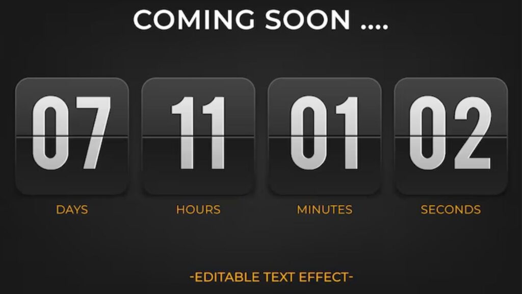
Countdown Timers
A ticking clock does wonders for conversion.
Countdown timers create urgency and a visual “ticking time bomb” that encourages users to act before time runs out.
Best places to use them:
Limited-time discounts
Event registrations
Free shipping offers
Pro tip: Place the timer above the fold, repeat it near the CTA, and make it visible on mobile. Use tools like:
Deadline Funnel
OptinMonster
Elementor Countdown Widget
Just don’t fake timers or reset them every time, users notice, and trust is lost.
Low Stock Notifications
Scarcity is a primal motivator.
Seeing “Only 2 items left!” or “Selling fast!” nudges users to complete the purchase before it’s too late.
Make it real. Make it believable. Tools like:
WooCommerce Low Stock plugin
Shopify’s Inventory Scarcity apps
Use clear, bold text with icons to catch attention without disrupting the experience.
Limited-Time Offers and Flash Sales
Flash sales trigger FOMO because they’re fleeting.
Design tips:
Use bold banners or popups
Include the deadline prominently
Pair with countdowns for added urgency
Flash sales don’t just sell products, they also create buzz around your brand.
Live Visitor Counters
Ever seen “143 people are viewing this item right now”?
That’s FOMO mixed with social proof.
It tells users:
They’re not alone
Others are interested (so the product must be good)
They may lose their chance to buy
Plugins like Proof, Fomo.com, or UseProof can create real-time user activity notifications.
Use sparingly to avoid overwhelming visitors.
Recent Purchase Popups
Also known as live sales notifications, these show real-time purchases by other users.
Example: “Sarah in LA just bought this!”
It’s subtle, persuasive, and highly effective especially for first-time visitors who need reassurance.
Tools:
TrustPulse
Fomo
Beeketing for Shopify
These create a dynamic sense of social activity and momentum.
Limited-Time Bonuses or Freebies
Offering a bonus or freebie that disappears after a set time is another powerful FOMO technique , especially for lead magnets, webinars, or product launches.
Examples:
“Sign up in the next 15 minutes to get a free eBook”
“First 20 buyers get a bonus course module”
“Enroll today and get 1-on-1 support”
Design tips:
Highlight the bonus expiration
Use contrasting colors to emphasize urgency
Show a progress bar (e.g., “17/20 bonuses claimed”)
It adds a layer of value that can tip hesitant visitors over the edge.
User-Generated Content as FOMO
Real people using your product = serious credibility.
Encourage users to share photos, testimonials, and reviews that you can showcase on your site.
Display UGC using:
Review sliders
Instagram feeds
User-submitted galleries
Phrases like:
“Join 2,000+ happy customers”
“See what our users are saying”
…create FOMO by showing that others are getting value right now and the visitor isn’t (yet).
Exclusive Memberships or Early Access
“Apply to join,” “Request an invite,” or “Early access only” taps into the psychology of exclusivity.
This works incredibly well for:
Membership sites
SaaS tools
Online courses
Product launches
FOMO is strongest when users feel they’re being left out of something valuable or private.
Design tips:
Use password-protected pages
Clearly explain the limited nature of access
Offer waitlists to increase anticipation
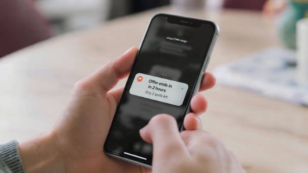
Exit-Intent FOMO Popups
Before someone bounces, hit them with a last-chance offer.
Exit-intent popups are triggered when a user’s cursor moves toward the close button or address bar.
Use this opportunity to show:
A discount code
A limited-time freebie
A reminder that the sale is ending
Tools like OptinMonster, Poptin, or Sleeknote make it easy to implement exit-intent on your site.
It’s your final shot to re-engage and FOMO makes it stick.
Abandoned Cart FOMO Emails (UX Continuity)
Your website’s job doesn’t end at the cart. When users abandon, bring them back with email sequences that trigger FOMO.
Best practices:
Send a reminder email within an hour
Use copy like: “Your item is almost gone” or “Only 1 left don’t miss out!”
Add an expiration timer to the discount or cart hold
Consistent design between your site and your emails makes the FOMO feel seamless and authentic.
Using Color and Contrast to Highlight Urgency
Colors can scream urgency without a single word.
Use:
Red for time-sensitive alerts
Orange or yellow for limited offers
High-contrast CTAs to draw the eye
Pair color with:
Clock icons
Warning symbols
Bold typography
This combination grabs attention and adds subtle psychological pressure to take action now.
Copywriting That Triggers FOMO
The words you use are just as important as design.
Trigger phrases:
“Don’t miss out”
“Last chance”
“Offer expires tonight”
“Only a few spots left”
“Selling out fast”
These can go in:
Button text (“Get My Spot Now”)
Headlines (“Only 10 left!”)
Popups (“Your chance ends in…”)
The right words create emotion and emotion drives action.
Mobile FOMO Techniques
Mobile users act fast and often impulsively.
To apply FOMO effectively on mobile:
Use sticky countdown bars
Create popups that are easy to dismiss
Enable push notifications for sales or live events
Keep messaging short and punchy
Make sure all urgency tactics are responsive and not intrusive on small screens.
FOMO on mobile should feel urgent, not annoying.
Ethical Use of FOMO
Here’s the thing fake urgency is a trust killer.
Don’t:
Lie about stock levels
Use fake purchase notifications
Create false countdowns that reset every visit
Instead, focus on genuine scarcity, real user actions, and limited offers that are honest.
Long-term trust > short-term conversions. Always.
FOMO is one of the most effective persuasion tactics in modern web design but only when used ethically and strategically.
When done right, FOMO:
Boosts engagement
Increases conversions
Encourages fast decision-making
Builds momentum and social proof
Whether you’re selling products, promoting an event, or growing an email list, FOMO techniques give your users a reason to act now not later.
So test, measure, refine and start using fear (the good kind) to your advantage.